
PACKAGING DESIGN
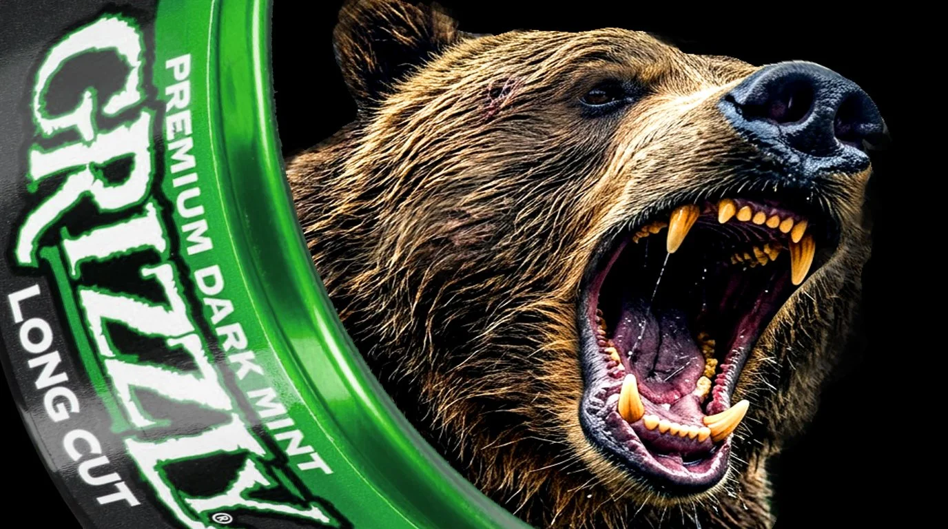
GRIZZLY - THE ORIGIN OF A $500M CATEGORY LEADER
We weren't going to out-heritage the category leaders. So we changed the basis of competition. Conwood recruited me to help originate a new smokeless tobacco brand capable of taking on two deeply established competitors: Copenhagen and Skoal. I worked directly with the marketing team to define the consumer, positioning, name, identity, packaging and visual brand platform that would give this challenger a reason to exist.
The brand became Grizzly. And Grizzly ultimately became the #1 moist smokeless tobacco brand in America, capturing approximately 31% market share and growing into a $500 million brand.
FINDING THE WHY BEHIND THE BUY™
We began by understanding what consumers were really buying. We studied how smokeless tobacco users lived, how they used the product, their attitudes and beliefs, and the role flavor, social identity, peer-group belonging, cultural acceptance and nicotine experience played in brand choice. The larger insight was simple: The brand a consumer chose said something about who he was. That became our brand compass.
FINDING THE OPEN TERRITORY
The established brands already occupied powerful positions. Copenhagen owned authenticity and heritage. Skoal owned familiarity, flavor and accessibility. We weren't going to beat established brands by imitating them. Instead, we would make their familiarity work against them.
GRIZZLY WOULD OWN INTENSITY.
Rugged. Powerful. Independent. Uncompromising. Grizzly's positioning was deliberately designed to make Skoal feel like your father's dip—and Grizzly the harder, more contemporary challenger for a different kind of consumer. We weren't simply offering another smokeless tobacco product. We were giving consumers an identity to adopt.
THE IDEA WAS IN THE NAME
That led to a simple question: What's the baddest alpha animal in the American wilderness? A bear. And what's the ultimate bear? A Grizzly. The name did enormous strategic work. Powerful. Wild. American. Dangerous. Unrefined. We paired that identity with the preferred wintergreen flavor profile and built the visual language around the same uncompromising attitude.
THE PACKAGE THAT BUILT THE CATEGORY LEADER
I created the original Grizzly visual identity and packaging system, translating the positioning into a shelf presence that was direct, confident and impossible to miss. The package didn't simply identify the product. It told consumers who the brand was—and something about who they were by choosing it. All of this was developed within the strict legal and regulatory requirements governing the category.
MORE ATTITUDE FOR THE MONEY
Grizzly didn't have generations of heritage. So we turned that disadvantage into an advantage. We made being the challenger part of the appeal. The established brands represented the familiar choice. Grizzly became the badass choice. Combined with a compelling value proposition, consumers weren't being asked to settle for a less expensive alternative.They could get more attitude for their money.
THE RESULT - #1 MOIST SMOKELESS TOBACCO BRAND ~31% U.S. MARKET SHARE ~$500M BRAND
What began as a challenger became the category leader.The positioning, name, identity and packaging created a foundation capable of taking Grizzly from market entrant to the top of the category. We didn't simply create another smokeless tobacco brand. We gave the challenger a reason to exist—and changed the basis on which consumers chose the category.
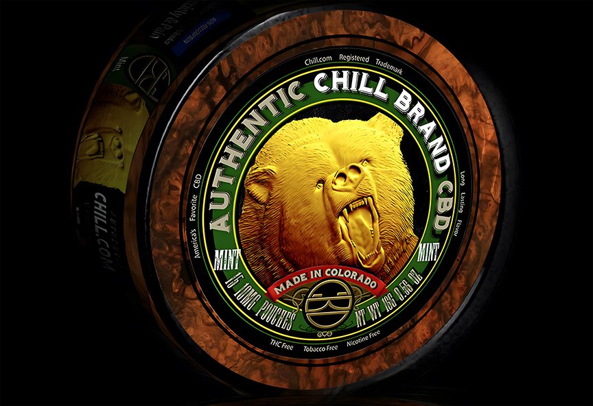
In a Crowded Category, Premium MUST Be Undeniable.
In an increasingly crowded CBD market, Chill.com needed packaging that would command attention and justify a premium position. I developed a distinctive visual identity centered around an intricately etched gold bear, creating an unmistakable shelf presence while reinforcing the brand's luxury positioning. The introduction of the Authentic Chill Brand CBD platform, combined with a Made in Colorado heritage story, infused the brand with authenticity, craftsmanship, and the free-spirited culture synonymous with Colorado. The result was premium packaging that differentiated the brand and elevated customer perception at the point of purchase.
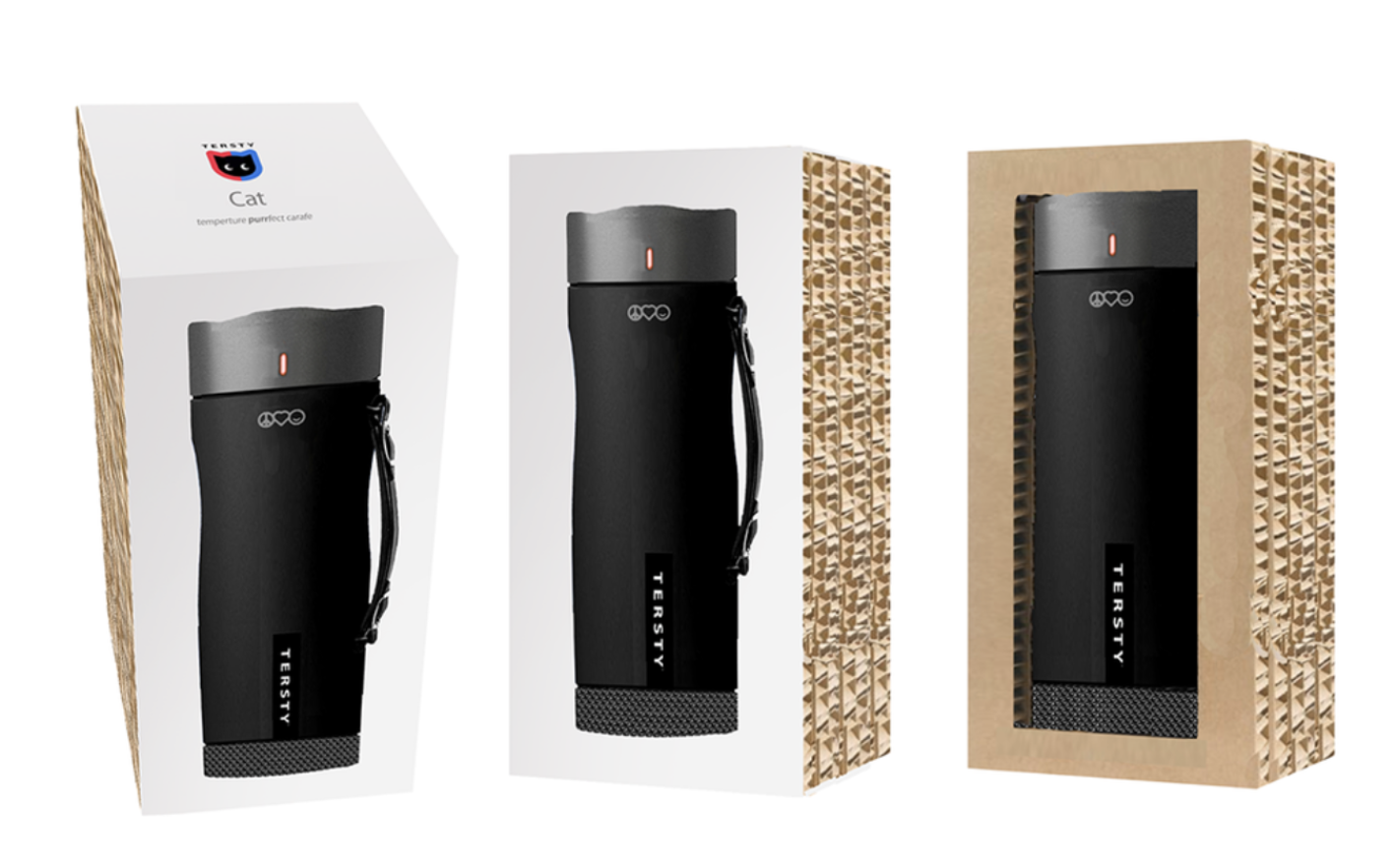
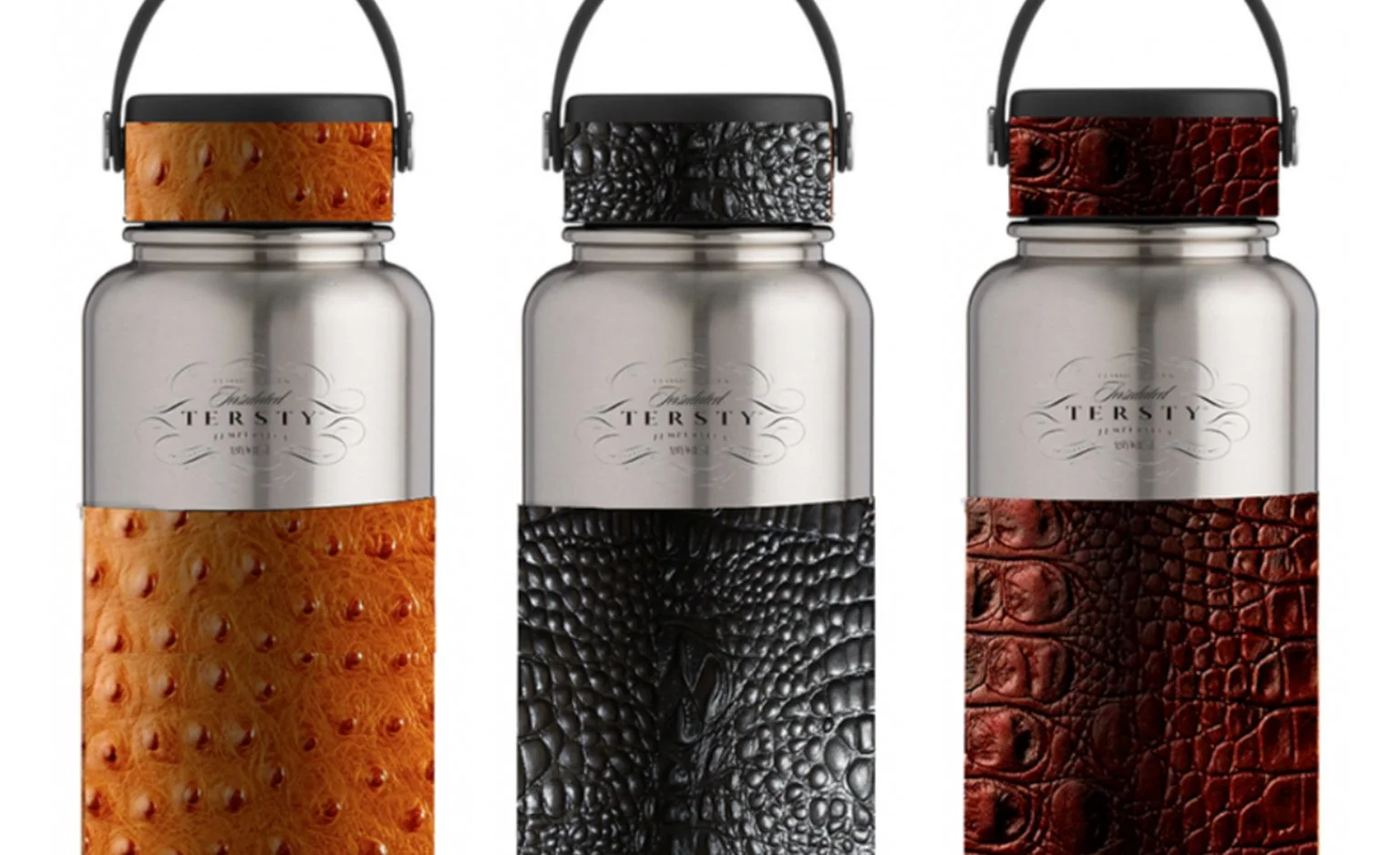
BEVERAGE CARAFE Design
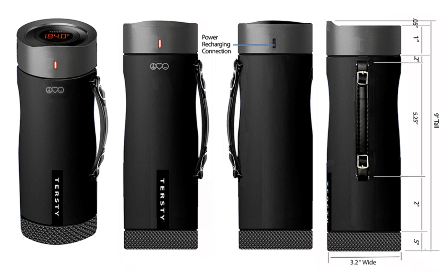
Tersty's beverage carafe deserved packaging that felt as considered as the product itself — modern, elegant, and built around the idea of temperature-perfect simplicity.
For the outer package, I designed a swiss styled modern solution that paired a gloss-finished outer sleeve with a raw corrugated structure — achieving genuine shelf presence and high perceived value without the cost of a fully custom package. The best packaging decisions solve two problems at once: how it looks and what it costs to produce.
I also created the Tersty Classic portable carafe - visually fusing an elegant stainless steel carafe and a designer handbag. I created all the industrial design work myself for our client.

The Package Became the Product Advantage.
Prestone had strong brand equity and packaging that was blending into the shelf. The redesign needed to fix both problems — visibility and usability — without losing what made the brand recognizable.
I pioneered a full-body shrink-sleeve application on a technically challenging bottle design and incorporated a self-pouring structure that made the product genuinely easier to use. The result was packaging that commanded attention at retail, communicated the brand's premium positioning, and gave consumers a functional reason to reach for it over the competition.
When the package works this hard, it stops being a container and starts being a competitive advantage.

When You Have a Legend on the Shelf, Use Him.
Entering a crowded category with a new product requires instant credibility. Jimmy Dean had something most beef jerky brands could never buy: a face people already trusted.
I developed the packaging design around the reintroduction of Jimmy Dean himself — bringing the founder back to the shelf at the moment the brand needed him most. The result was a package that felt instantly familiar, authentically differentiated, and backed by decades of consumer goodwill.
In a sea of anonymous jerky bags, a legend stands out.


Southern Flavor Isn't a Claim. It's a Heritage.
LaMont's had the product and the story — real Southern roots, real quality, real flavor. What it needed was a brand identity that made all of that unmistakable at the shelf.
I created the brand strategy, identity, and packaging system that translated LaMont's heritage into a retail presence as authentic as the product inside. The kind of design that doesn't just attract attention — it earns trust before the first bite.


Fresh Doesn't Just Taste Like Something. It Looks Like Something.
Sheffield Farms had genuine agricultural heritage and packaging that wasn't telling the story. Consumers buying milk and eggs want to feel the connection to where their food comes from — and the package is where that connection either happens or doesn't.
I created the "Fresh from the Farm" packaging strategy, developing milk and egg systems that translated Sheffield's heritage into a retail experience that felt as honest as the product itself. Freshness, quality, and authenticity — visible before the carton ever opens.

Protection Is the Product. The Package Has to Prove It.
Sunscreen is a category built on trust — consumers are choosing something they're putting on their skin, often on their kids. The packaging has to communicate protection, confidence, and credibility before anyone reads the label.
I designed the Sun Armor packaging system, translating performance and protection benefits into a visual identity that stood out at shelf and gave consumers an immediate reason to believe in what was inside.


When Art History Became Brand Strategy
Private label housewares live and die by perceived value, and most look exactly like what they are: safe, generic, forgettable. The opportunity here was unexpected — that the timeless visual language of historical art movements could be applied to products people reach for every day.
I built a design strategy rooted in heritage-inspired aesthetics, using the discipline of composition, color, and craft from art history to turn a commodity portfolio into something that felt considered, distinctive, and worth owning. The result: private label that didn't read as private label, and a shelf presence that gave shoppers a reason to choose it over the name brands beside it.


From Concept to Walmart Shelf. In One Season.
No client. No brief. No safety net.
I conceived, funded, designed, manufactured, and sold a proprietary holiday product line directly into Walmart — a themed "Santa's Workshop" sticker and storytelling system that transformed ordinary gifts into immersive Christmas experiences. Walmart sold out in seven days.
Sometimes the best way to prove you can build a brand is to build one yourself.
Tech Design Meets Industrial Strength
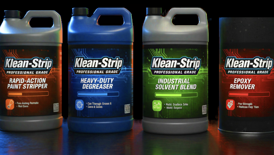
Klean Strip developed a next-generation line of solvents, degreasers, and strippers built on genuinely improved technology — and needed packaging that could prove it. We created a bold, tech-forward visual identity for the new Professional Grade line, a look never before seen in this category, signaling performance and innovation on shelf in an industry defined by generic, utilitarian design. The result positioned Klean Strip as a modern, forward-thinking leader in a space that hadn't evolved in decades.
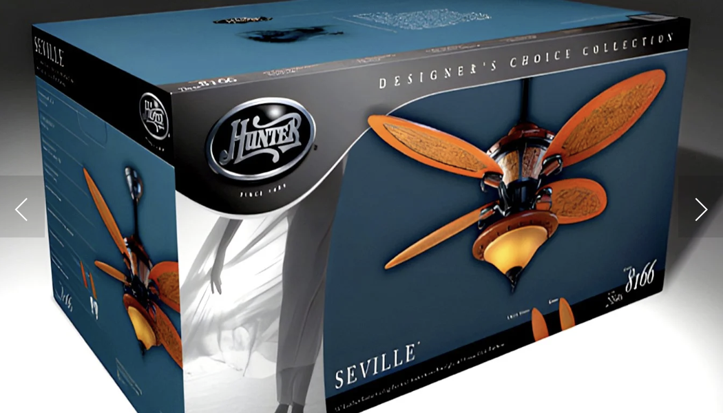
A Packaging System Built for Retail and the Jobsite
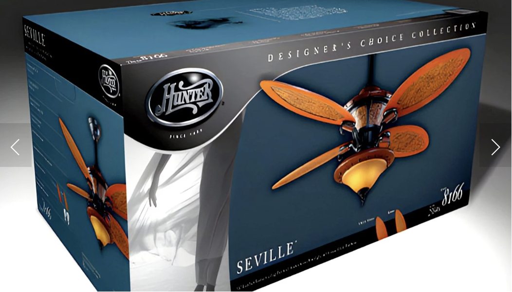
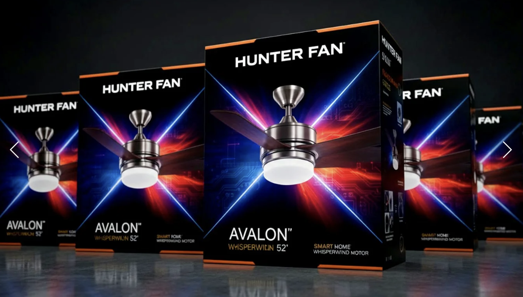
Redesigned the complete Hunter Fan packaging system across 250+ SKUs, creating a unified line — the Prestige Collection / Builder Select — engineered to serve both residential customers and home builders within a single, cohesive brand identity. The project also included developing a new line targeted at a younger, urban, modern audience, expanding the brand's reach beyond its traditional customer base. The scope spanned full-scale photography and retouching to ensure every box reflected the quality and craftsmanship inside.
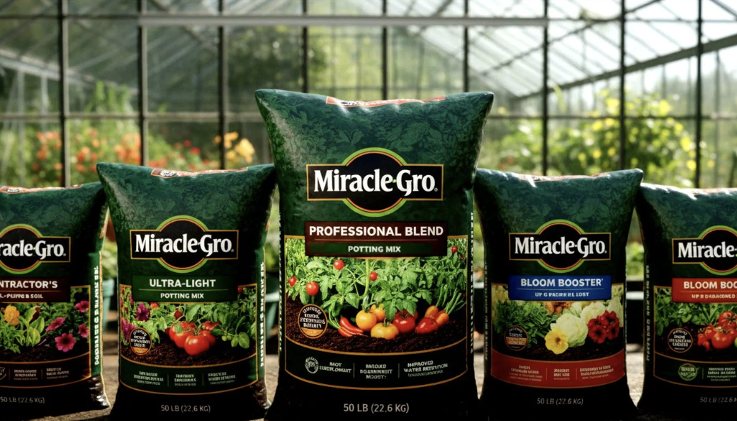
Less Dirt, More Bloom: Reimagining Miracle-Gro's Shelf Story
Miracle-Gro wanted a design upgrade that put the payoff front and center — vibrant flowers and vegetables — instead of the soil itself, moving away from the dirt-heavy imagery of the previous packaging. We shifted the visual focus to the results customers actually care about, paired with clear, benefit-driven copy right on pack to educate shoppers on exactly why the product justified its price. The redesign turned every package into a small sales pitch, making the value proposition impossible to miss at shelf.