
PACKAGING DESIGN

The Package That Built the Category Leader.
Every dominant brand starts somewhere. For Grizzly Long Cut, it started with the package.
I created the original visual identity and packaging design that gave Grizzly its distinctive shelf presence — a look that was direct, confident, and impossible to miss. What followed was a brand that captured 31.1% market share and became the leading moist smokeless tobacco brand in the United States, generating nearly 7% of Reynolds American's annual revenue.
The foundation was right from day one.


The Story Was Always There. We Just Told It Better.
East India Tea Company had centuries of history and packaging that looked like every other tea on the shelf. The opportunity was hiding in plain sight: the teas themselves — each with a distinct origin, culture, and story worth telling.
I reimagined the packaging strategy around the authentic origins of each tea, replacing generic British heritage visuals with globally inspired graphics and premium tin packaging that made every variety feel like a discovery. The brand's history became a reason to explore, not just a reason to trust.

Premium Look. Production-Smart Design.
Tersty's beverage carafe deserved packaging that felt as considered as the product itself — modern, elegant, and built around the idea of temperature-perfect simplicity.
I designed a solution that paired a gloss-finished outer sleeve with a raw corrugated structure — achieving genuine shelf presence and high perceived value without the cost of a fully custom package. The best packaging decisions solve two problems at once: how it looks and what it costs to produce.

The Package Became the Product Advantage.
Prestone had strong brand equity and packaging that was blending into the shelf. The redesign needed to fix both problems — visibility and usability — without losing what made the brand recognizable.
I pioneered a full-body shrink-sleeve application on a technically challenging bottle design and incorporated a self-pouring structure that made the product genuinely easier to use. The result was packaging that commanded attention at retail, communicated the brand's premium positioning, and gave consumers a functional reason to reach for it over the competition.
When the package works this hard, it stops being a container and starts being a competitive advantage.
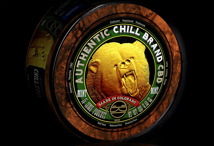
In a Crowded Category, Premium Has to Be Undeniable.
The CBD market had become a sea of sameness — similar products, similar claims, similar shelves. Chill needed to stand apart without saying a word.
I developed a packaging system that combined foil stamping, shrink-sleeve technology, and premium labeling to create something that felt genuinely luxurious at first touch. The design did what premium packaging is supposed to do: signal quality before the customer reads a single word, and make the decision feel easy.
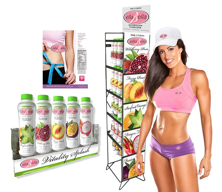
Built From Nothing. Ready for Everything.
EllaBella Vitality Splash didn't exist until it did — and then it needed to be complete.
I directed every element of the brand from the ground up: formulation, positioning, identity, packaging, retail merchandising, and sales support materials. Not a series of separate deliverables handed off to different teams, but a single integrated platform where every touchpoint reinforced the same brand promise.
From concept to shelf, ready to compete.


The Brewery Had a Better Story Than the Beer They Were About to Launch.
The plan was to launch a premium beer under a forgettable name. The brewery behind it had been making beer since 1888 and was the second oldest in America. The better brand was already there — it just wasn't the one they were planning to use.
I repositioned the concept around the brewery's Adirondack heritage and founding date, creating the Saranac brand — a name, identity, and packaging system that felt earned rather than invented. The result was an International CLIO Award for Best Beer Packaging and a brand that became the brewery's flagship product line.
Sometimes the best creative decision is recognizing what you already have.

When You Have a Legend on the Shelf, Use Him.
Entering a crowded category with a new product requires instant credibility. Jimmy Dean had something most beef jerky brands could never buy: a face people already trusted.
I developed the packaging design around the reintroduction of Jimmy Dean himself — bringing the founder back to the shelf at the moment the brand needed him most. The result was a package that felt instantly familiar, authentically differentiated, and backed by decades of consumer goodwill.
In a sea of anonymous jerky bags, a legend stands out.


Southern Flavor Isn't a Claim. It's a Heritage.
LaMont's had the product and the story — real Southern roots, real quality, real flavor. What it needed was a brand identity that made all of that unmistakable at the shelf.
I created the brand strategy, identity, and packaging system that translated LaMont's heritage into a retail presence as authentic as the product inside. The kind of design that doesn't just attract attention — it earns trust before the first bite.


Fresh Doesn't Just Taste Like Something. It Looks Like Something.
Sheffield Farms had genuine agricultural heritage and packaging that wasn't telling the story. Consumers buying milk and eggs want to feel the connection to where their food comes from — and the package is where that connection either happens or doesn't.
I created the "Fresh from the Farm" packaging strategy, developing milk and egg systems that translated Sheffield's heritage into a retail experience that felt as honest as the product itself. Freshness, quality, and authenticity — visible before the carton ever opens.

Protection Is the Product. The Package Has to Prove It.
Sunscreen is a category built on trust — consumers are choosing something they're putting on their skin, often on their kids. The packaging has to communicate protection, confidence, and credibility before anyone reads the label.
I designed the Sun Armor packaging system, translating performance and protection benefits into a visual identity that stood out at shelf and gave consumers an immediate reason to believe in what was inside.

Soup That Goes Where You Go.
The insight was simple: people love soup, but soup doesn't travel well. Go Appetit was built to change that.
I led the identity and packaging development for the brand, translating a "soup-on-the-go" concept into a visual system that communicated convenience, freshness, and modern lifestyle appeal at a glance. The design gave the product a clear reason to exist — and made that reason impossible to miss on shelf.

What's Inside Should Show on the Outside.
The nutraceutical market is crowded with products making similar promises. Aqua Ten needed packaging that communicated its benefits with clarity and a brand presence that felt as premium as the science behind it.
I led the brand strategy, positioning, and packaging development — translating Aqua Ten's product benefits into a visual identity that elevated perceived value, created genuine shelf differentiation, and gave the brand a foundation strong enough to grow from.


Art History Made the Perfect Brand Strategy.
Private label housewares live and die by perceived value — and most of them look exactly like what they are. The opportunity here was unexpected: the timeless visual language of historical artistic movements, applied to products people buy every day.
I developed a design strategy that drew from heritage-inspired aesthetics to transform a commodity portfolio into something that felt considered, distinctive, and genuinely worth owning. The result was private label that didn't look like private label — and a retail experience that gave shoppers a reason to reach for it over the name brands.


From Concept to Walmart Shelf. In One Season.
No client. No brief. No safety net.
I conceived, funded, designed, manufactured, and sold a proprietary holiday product line directly into Walmart — a themed "Santa's Workshop" sticker and storytelling system that transformed ordinary gifts into immersive Christmas experiences. Walmart sold out in seven days.
Sometimes the best way to prove you can build a brand is to build one yourself.


Every Great Coffee Has a Story. This One Finally Looked Like It.
Heritage is only an asset if the packaging makes you feel it. This brand had the history — the craftsmanship, the legacy, the years of getting it right. The packaging just wasn't carrying any of that weight.
I reimagined the design around the brand's story, creating a visual platform that made the heritage tangible — something a customer could see and feel before the first sip. Elevated perceived value, stronger shelf differentiation, and a brand that finally looked as good as it tasted.